Documenting my R Learning Quest Vol.2
I have had for some time this need to present tables including some conditional formatting of cells. In my quest for the perfect table displaying library I have found nothing, it seems it is not a need for many. I’ll be storing here my attempts and discoveries.
Some time ago I was playing with correlations and I ended up producing this:
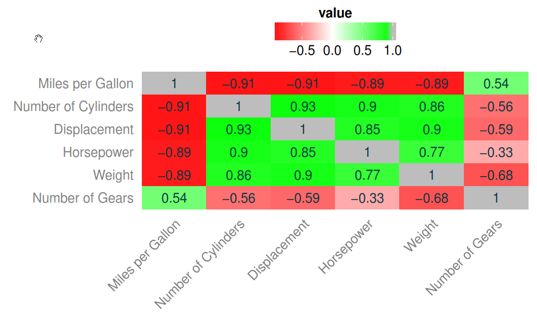
To create that plot (ugly colours, I know, but it is only a quickie) I adapted some things from here and here.
This is the R code I used, plus the plot title I forgot to include in the screen caption:
First, the required packages and the example data:
library(ggplot2)
library(reshape2)
library(ggthemes)
data(mtcars)
Now, construct the palettes.
red=rgb(1,0,0)
green=rgb(0,1,0)
white=rgb(1,1,1)
RtoWrange<-colorRampPalette(c(red, white))
WtoGrange<-colorRampPalette(c(white, green))
Prepare the data for ggplot2 consumption.
df <- with(mtcars, data.frame(mpg, cyl, disp, hp, wt, gear))

cor_matrix <- round(cor(df, use = "pairwise.complete.obs",
    method = "spearman"), digits = 2)

cor_dat <- melt(cor_matrix) ; cor_dat <- data.frame(cor_dat)

levels(cor_dat$Var1) <- list("Miles per Gallon" = "mpg",
                             "Number of Cylinders" = "cyl",
                             "Displacement" = "disp",
                             "Horsepower" = "hp",
                             "Weight" = "wt",
                             "Number of Gears" = "gear")

levels(cor_dat$Var2) <- rev(list("Miles per Gallon" = "mpg",
                                 "Number of Cylinders" = "cyl",
                                 "Displacement" = "disp",
                                 "Horsepower" = "hp",
                                 "Weight" = "wt",
                                 "Number of Gears" = "gear"))
Plotting time.
ggplot(cor_dat, aes(Var1, Var2, fill = value)) +
    geom_tile() +
    geom_text(aes(Var1, Var2, label = value),
              color = "#073642", size = 4) +
              scale_x_discrete(expand = c(0, 0)) +
              scale_y_discrete(expand = c(0, 0)) +
              labs(x = "", y = "") +
    guides(fill = guide_colorbar(barwidth = 7,
        barheight = 1, title.hjust = 0.5)) +

    theme(axis.text.x = element_text(angle = 45,
        vjust = 1, hjust = 1),
        panel.grid.major = element_blank(),
        panel.border = element_blank(),
        panel.background = element_blank(),
        axis.ticks = element_blank(),
        legend.justification = c(1, 0),
        legend.position = "top",
        legend.direction = "horizontal") +

    guides(fill = guide_colorbar(barwidth = 7,
        barheight = 1, title.position = "top",
        title.hjust = 0.5)) +

    scale_fill_gradient2(low=RtoWrange(100),
        mid=WtoGrange(100), high="gray") +

    ggtitle("Fig.2 Correlation plot")
This is just the beginning.
